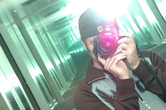
First off, before I go any further. If you read nothing more than this paragraph, remember this one thing, take more pictures. Wether you're shooting a group shot of 5 of your best friends, or a beautiful sunset, always take at least 2-3 more photos than you think you should. Granted popping the flash inside some restaurant 6 times will inevitably make the entire place hate you, and blind your friends....but... well you get the point, its better to take 10 shots and get one good one, than to take 3 shots and have nothing worth keeping. So many great photos can be ruined by the smallest changes in light, the blink of an eye, etc...SO TAKE MORE PHOTOS than you think you should.
Alright, that being said, here are a few simple steps that will change the way you compose your photos, improve your existing pictures and impress your friends.
When you look at a photo you, for the most part, like it or hate it instantly. You may not even realize how much you dislike a photo at first glance, but try this; look through your own gallery right now (or after you're done reading this) =), and take note of the photos you have to squint at to see better, or the ones you just breeze through without a second glance, and focus on the ones that just seem pleasing for no apparent reason. There are a lot of reasons why you don't really like the image, and if you have the time, and understand why, you can generally fix each one of them or prevent repeating that photo in the future.
Compositional factors are at work in every image on a subconscious level, the most powerful is the rule of thirds.
The Rule of Thirds
If you split every image into three sections (top to bottom or side to side) you'll start to find that the photos that are most pleasing to the eye have excluded the subject from the middle third and moved it to the outer thirds: see below: ( this rule doesn't always apply, centering your subjects can still be powerful and moving, but for the most part you want to avoid centering)

Notice that the tree is the main subject and it's located in the right 3rd portion of the photo.
Where as a centered subject isn't as aesthetically pleasing:

Most people don't realize the brain interprets negative space and positive space when looking at a photo. Balance and weight are added to subjects as your eye moves from point to point on the photo. Your brain typically interprets this data in distinct patterns. Photos that go against the natural flow of eye movement break that pattern and are less pleasing to the eye.
The Diagonal Rule
Following the principle behind the rule of thirds, comes the diagonal rule. And like it sounds it has to do with the natural diagonal lines found in a photo. When you look at a photo your eyes naturally want to be guided towards the center of the image. Diagonal lines in the photo will direct your attention in that order, if there aren't any, it becomes distracting to the brain and less aesthetically pleasing. For example:


Notice how the natural lines in these photos grab your attention and constantly pull your eyes back to the center of the photo.
I often find this to be more difficult to be conscious of while taking a photo. I generally have to edit photos after the fact to follow the rule of diagonals, but keeping it in mind while composing the photo will definitely improve your shots.
EYE LEVEL and CAMERA ANGLE
Probably the most common problem in boring/unflattering photos is the angle at which the picture is taken and the position of the subjects eyes in the photo. The worst and most unflattering way to take a picture of someone if from a low point of view (kneeling with a camera taking a picture of a person standing up). Unless double chins are your thing, you generally want to raise the camera a little taller than feels normal, and position the eye level of the subject in the top third of the photo. Following the rule of thirds.
For example:

In this photo the eye level is such that it positions the subject in most of the frame. Something you want to stay away from would be this for example:

The average eye level is towards the middle of the photo, leaving too much open space above the group of guys. Had the picture been angled down slightly, exposing more of the body and using less of the empty dark space above, the photo would be nice to look at. This is that same photo cropped:

Notice here that while the same amount of the guys bodies are in the picture, they fill more of the frame. The eye level has been moved to the upper third portion of the frame, and its more pleasing to the eye. That is of course if you find a photo of 7 drunk guys pleasing to the eye, I think its difficult to look at the photo either way, but it illustrates my point nicely =)
(It's also a good practice to take pictures of subjects (not people) from an unnatural perspective. Don't just stand straight up, bring the camera to your eye level and shoot something. Get close to your subject, put the camera on the ground, or directly above your subject and take a picture of it in a way you normally wouldn't view it.)
There are a lot of editing techniques you can use to correct most compositional problems with photos, but in doing so you lose a lot of the original image. I will go over some basic photo editing techniques in another blog soon.
Hope this helps,
-David


No comments:
Post a Comment